A Colorful Trip Down Memory Lane
Starting in 2017, we have explored rich colors ranging from deep purples to soothing greens to warm reds and refreshing aquas. Each year our color experts highlight trends that reflect the pulse of culture, art, fashion, and home décor to curate palettes that will bring new life and energy into your home. We are excited to announce Artifact (MEN10-16) as the 2027 color of the year. Any guesses on what we will pick for 2028?
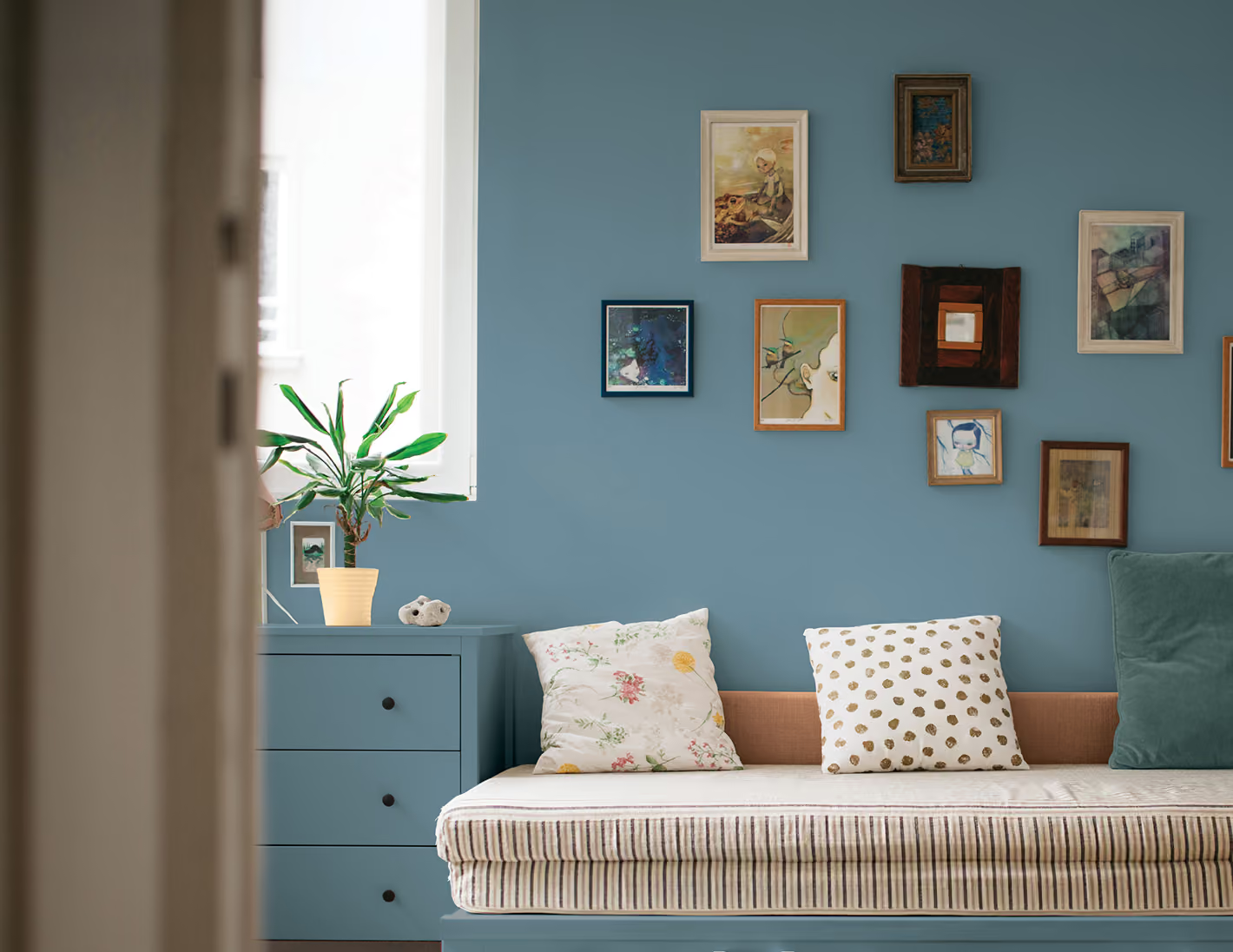
2027: Artifact (MEN10-16)
Artifact is a calm, fresh aqua that freshens things up without losing what makes your space yours, allowing homeowners to create a look that feels authentic to them. It delivers that "hit reset" feeling people are craving, refreshing a room with a sense of balance and optimism while preserving the character, memories, and personality that already make it feel like home. Zero renovation stress required, just a simple color reset to make your space feel more aligned with the way you want to live.
View Artifact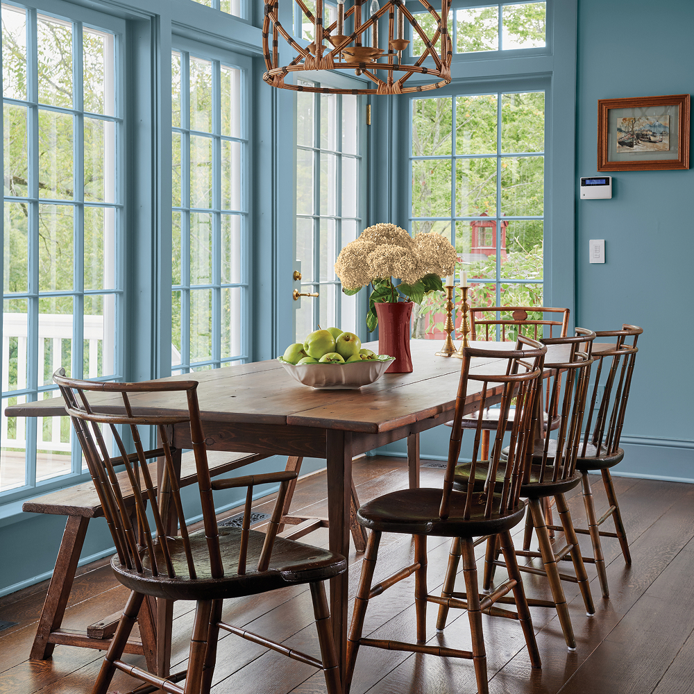
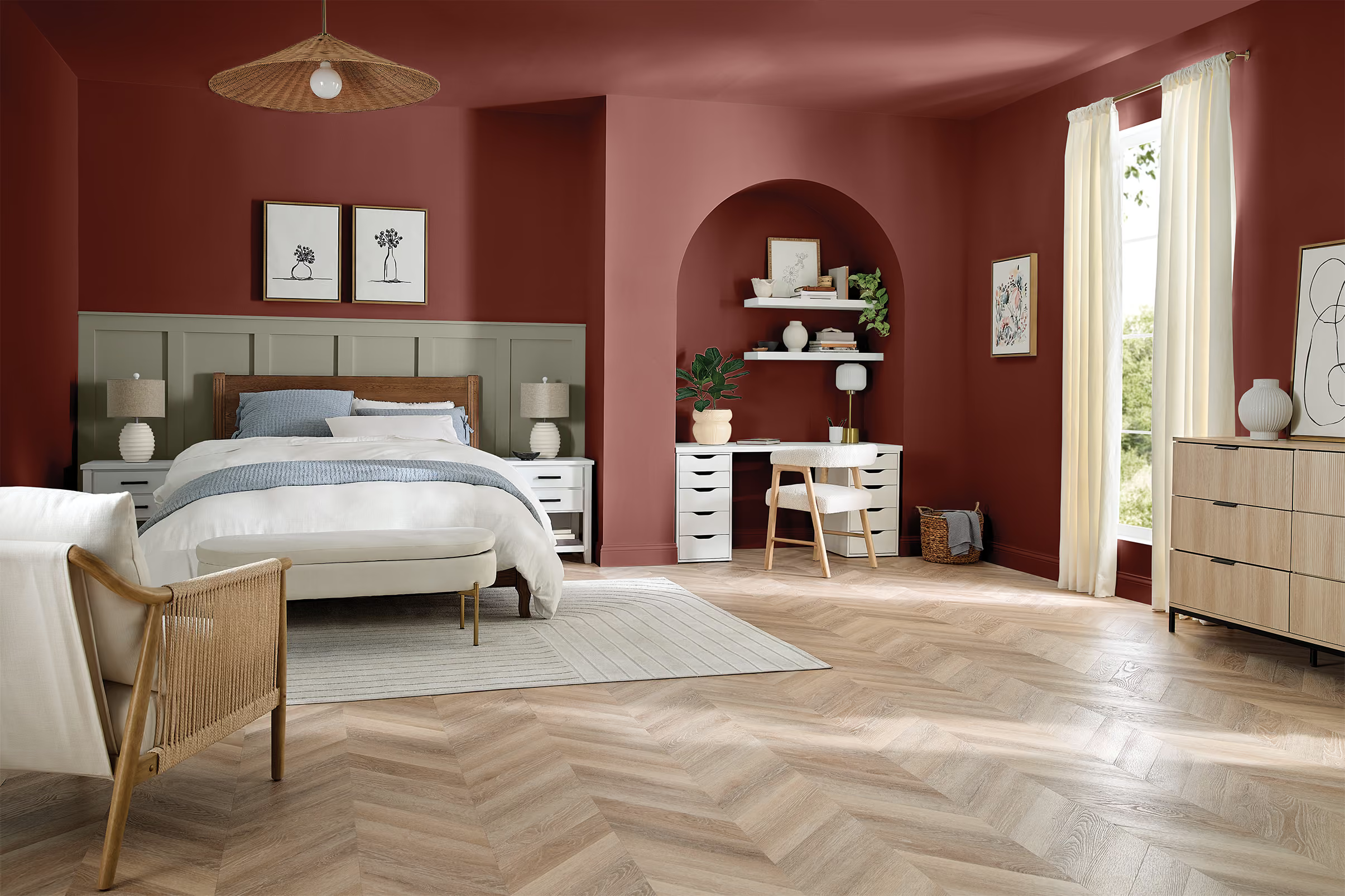
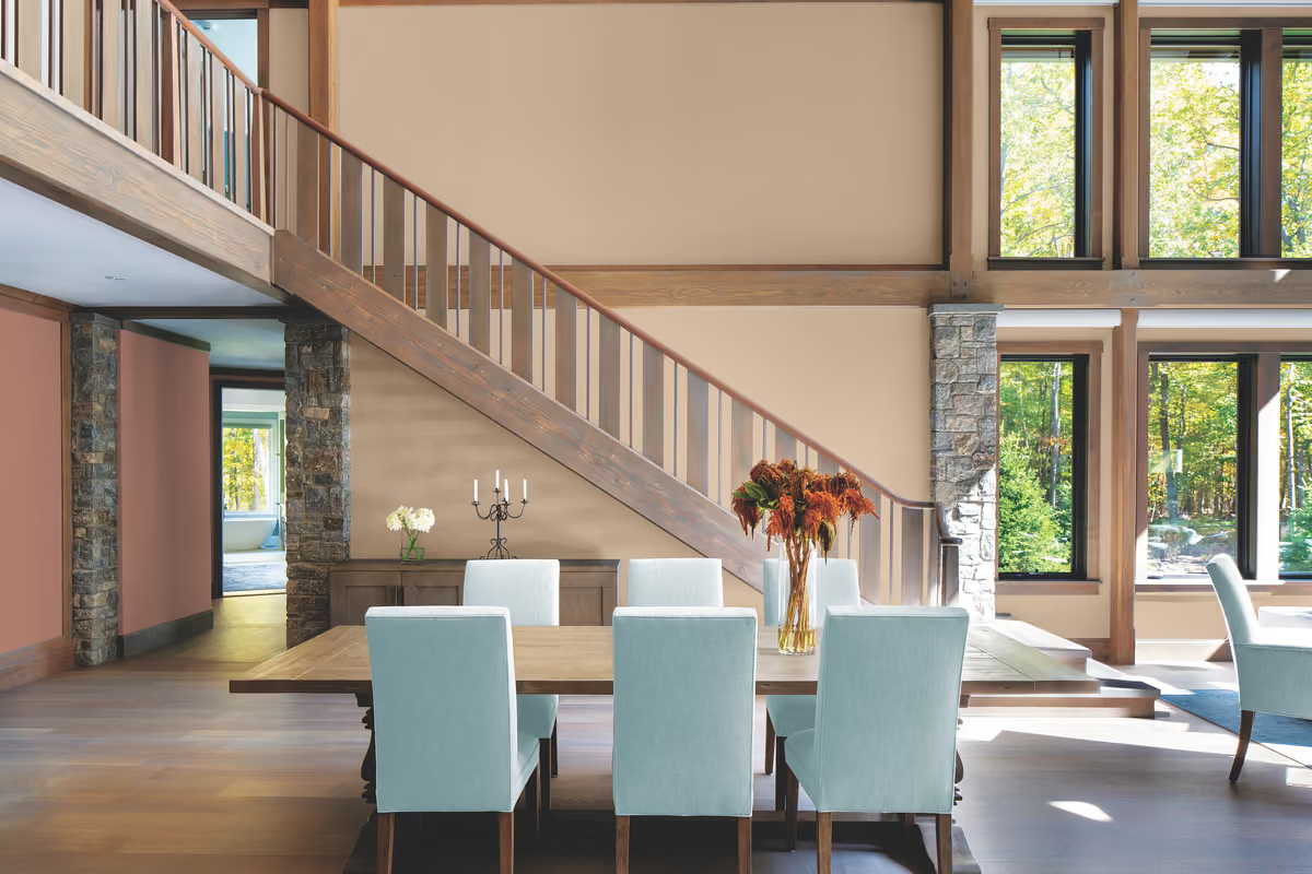
2026: Warm Mahogany (MEN7084-6)
Warm Mahogany is a rich, grounded & timeless red that adapts itself for the mood and purpose of any space. Consumers are increasingly keen to select colors that fit within the larger lifestyle of a space, not just one prescribed function or moment in time, and are torn between finding a color that feels authentic, personal and safe that one that offers a rush of newness, risk and excitement. Enter Warm Mahogany - representing the relief found in juxtaposition and removes the boundaries of abiding by trends. Warm Mahogany thrives in spaces craving connection, rest and play.
View Warm Mahogany2025: Purple Basil (MEN7054-6)
Purple Basil speaks to the continuation of consumers unapologetically selecting colors that bring them joy, worrying less and less about resale value and creating your space because of YOU. Consumers are becoming more and more comfortable with color, and BOLD color, and Purple Basil gives you that freedom to empower a bold color.
View Purple Basil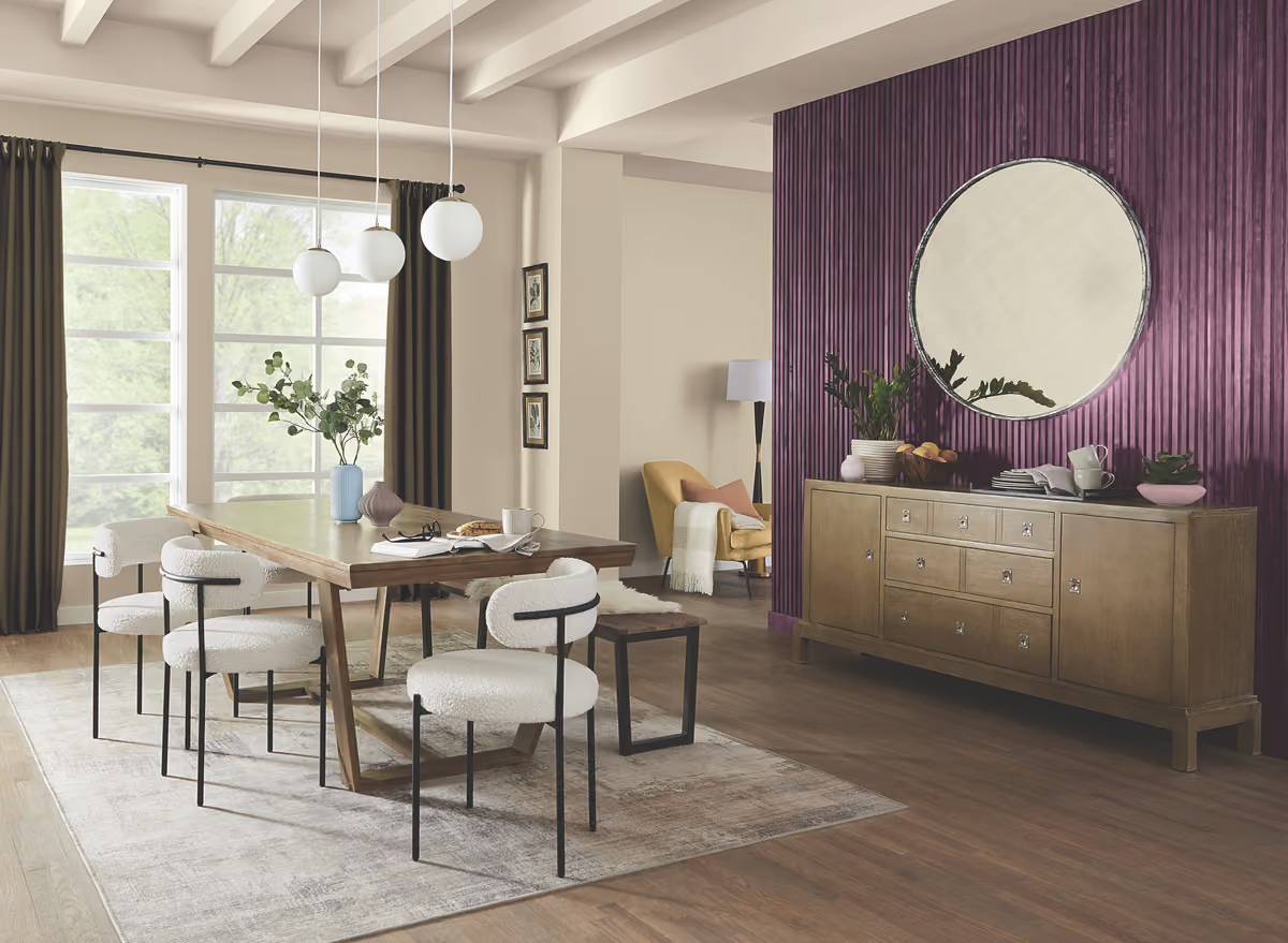
2024: Limitless (MEN7132-2)
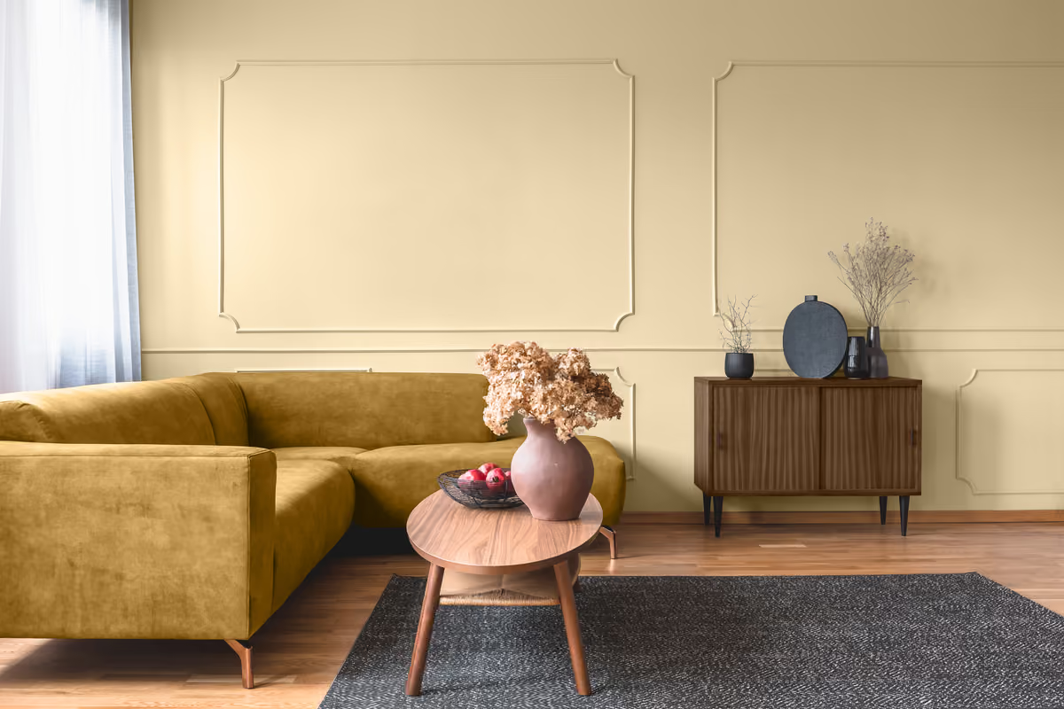
Limitless, a warm honey beige, was selected to reflect consumers’ growing desire to express their personality in whatever way makes them happy. This fresh and energizing take on a neutral makes it simple to upgrade neutrals and freshen up a space.
View Limitless2023: Vining Ivy (MEN7014-5)
Vining Ivy is an enchanting, deep aqua representing contemporary and traditional styles, perfectly marrying a touch of the past and a taste of the future. Nods to nature continue to grow in popularity, and Vining Ivy blends blue and green for a tranquil backdrop that is energizing yet grounding. Its versatility takes the guesswork out of design, leaving consumers with more time to indulge in the things that matter most to them.
View Vining Ivy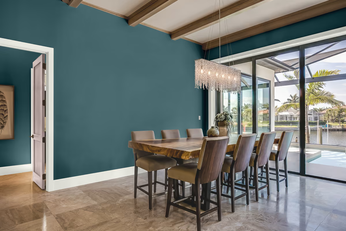
2022: Olive Sprig (MEN7169-4)
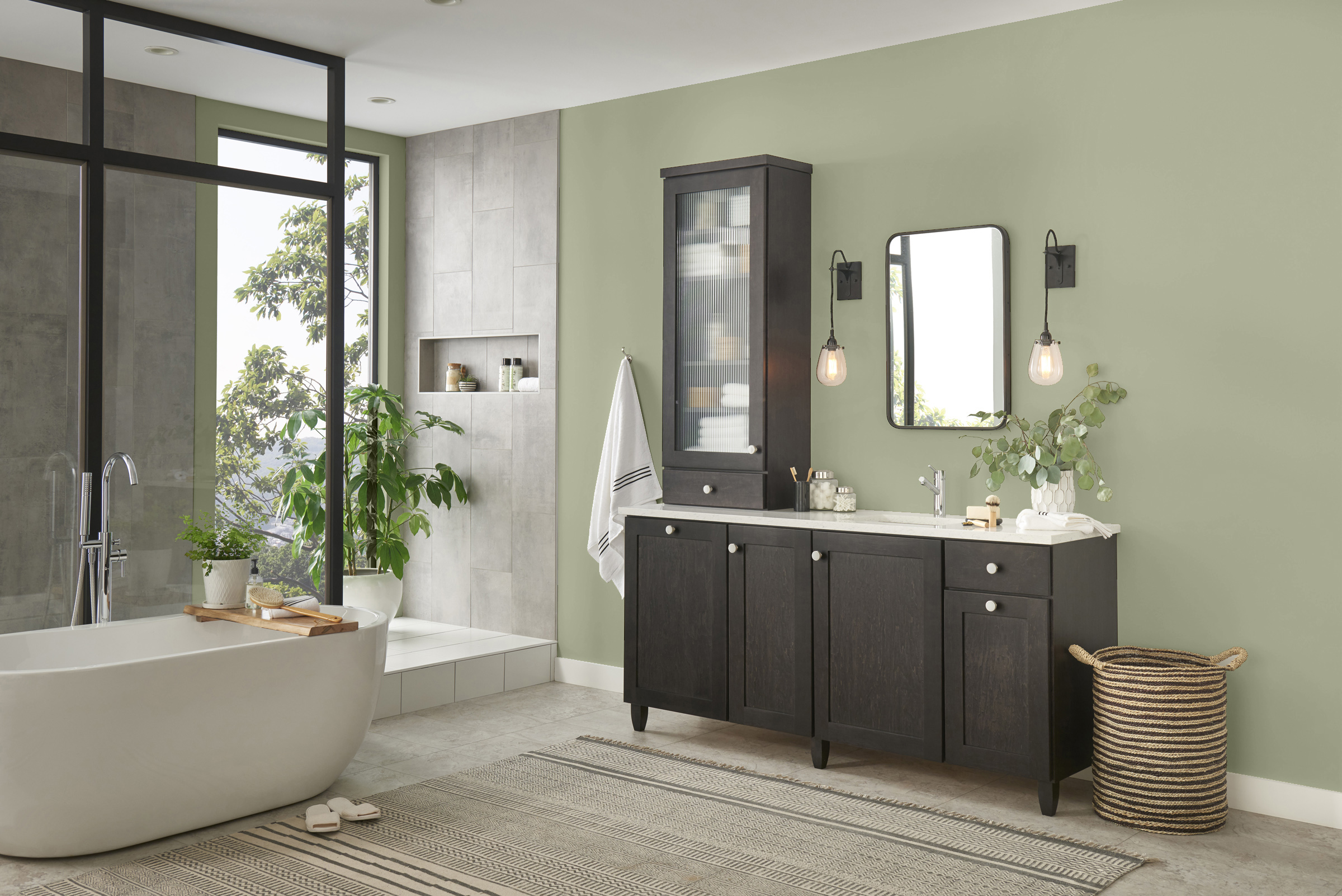
This spirited yet soothing green brings an organic energy to any space, and since we had all just lived through the strangest year on record, homeowners are searching for rejuvenation and growth. Whether it is for its calming qualities or its health benefits, “green” has become a staple for wellbeing.
View Olive Sprig2021: Palette of the Year –
Transcend (MEN7114-3), Big Cypress (MEN7093-4), Misty Aqua (MEN7007-3)
An organic and hopeful color palette representing what we have been longing for after decades of overstimulation and overconsumption: simplicity and restfulness. Rather than selecting a single Color of the Year, a palette was chosen to give consumers more flexibility and choice during a time when so many aspects of daily life felt beyond their control.
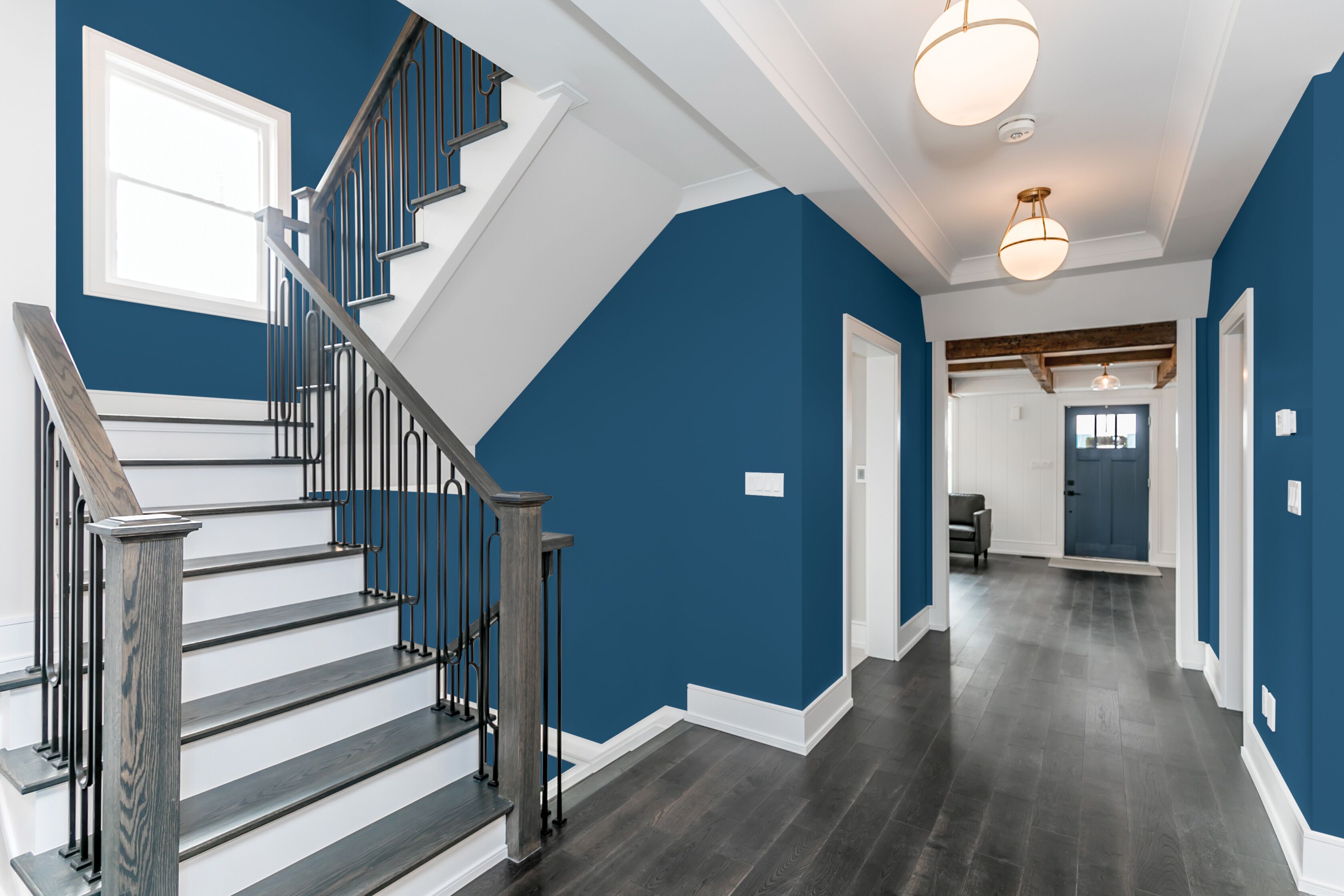
2020: Chinese Porcelain (MEN7033-5)
In a world where sleep is viewed as a luxury and the anxiety of a fast-paced life is all too real, Chinese Porcelain offers escapism in today’s technologically-driven society. The blend of cobalt and moody ink blue imparts calmness and restful sleep while also offering the spirit of hopefulness – a precious commodity in a restless world.
View Chinese Porcelain2019: Night Watch (MEN7005-6)
The restorative power of nature is important in society now more than ever, and Night Watch is about bringing the healing power from the outdoors into your home through color. The dark green hue pulls our memories of natural environments to the surface to recreate the calming, restorative feelings that nature evokes.
View Night Watch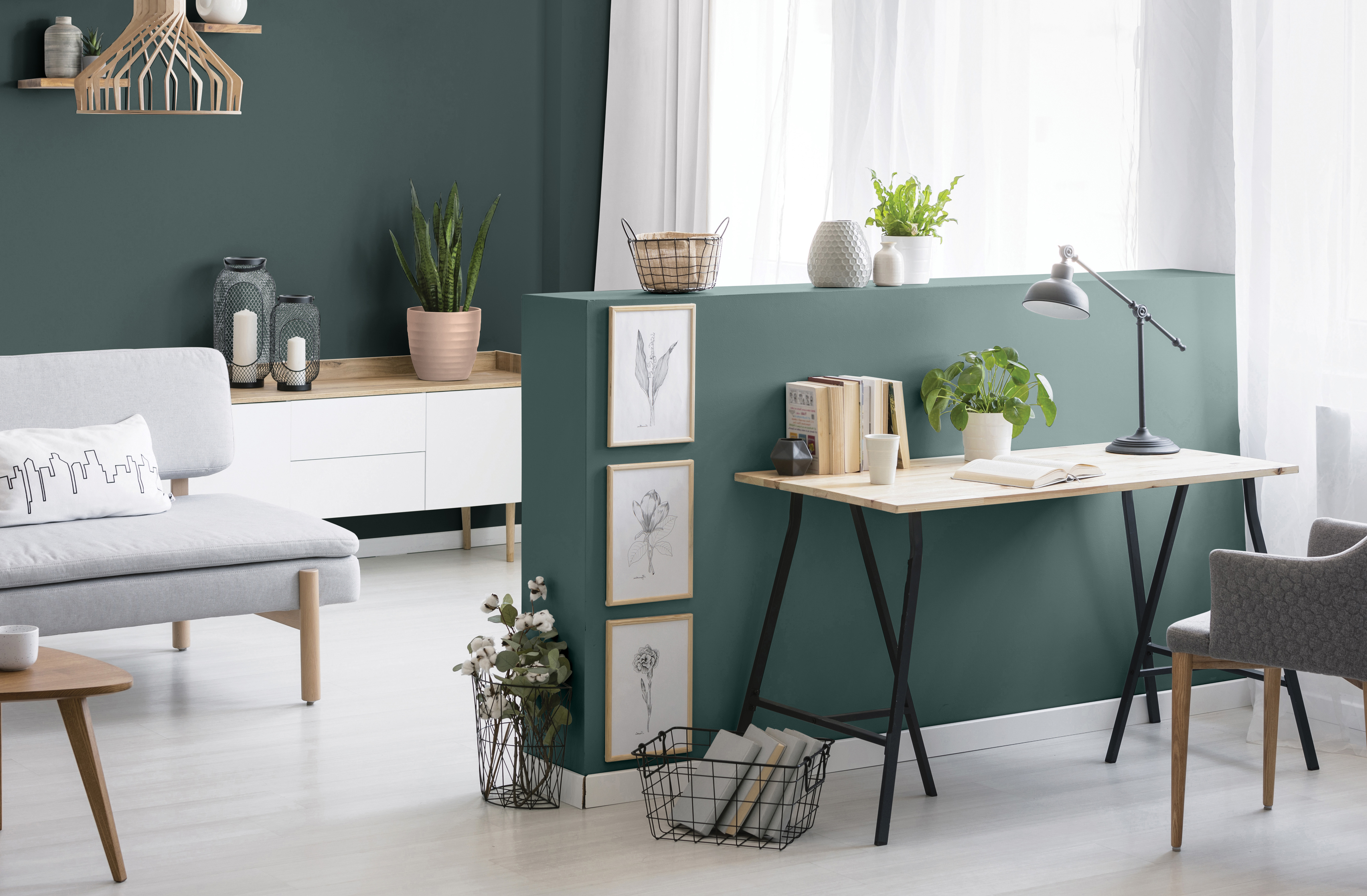
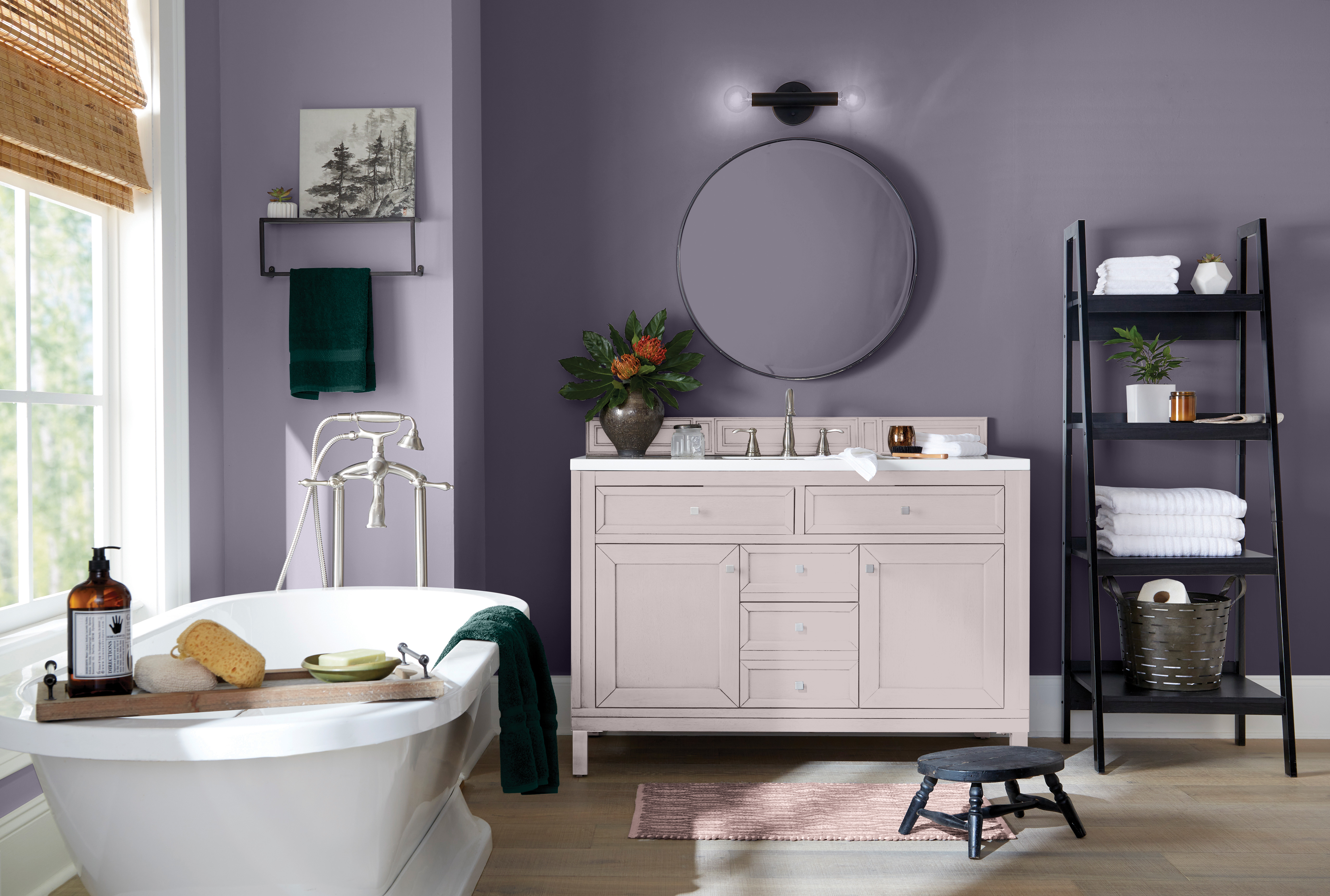
2018: Blackhearth (MEN7080-6)
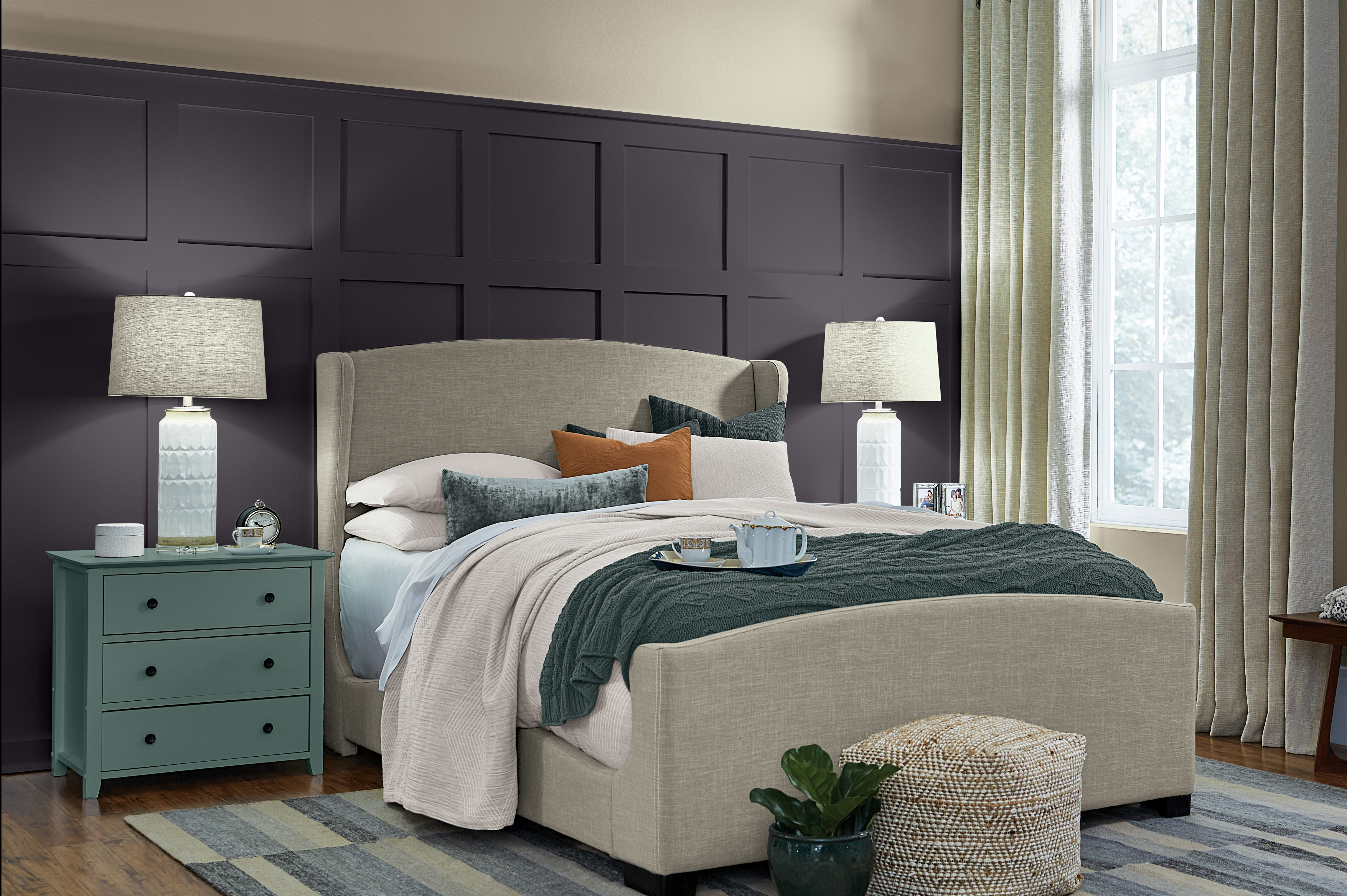
A statement-making black with subtle purple undertones that offered comfort and a quiet retreat from life's constant hustle and connectivity. Blackhearth reflected consumers' desire to express their individuality while embracing a more minimalist approach to home design, creating a clean backdrop that allowed personal style and experiences to take center stage.
View Blackhearth2017: Silverado (MEN7049-5)
A deep, mystic purple that pairs beautifully with trending gray tones. Silverado reflects the consumers' growing curiosity about the future, drawing inspiration from themes of space, spirituality, technology and the passage of time.
View Silverado